Gutenberg Diagram
“Consider the Gutenberg diagram is assist in layout and composition when the elements are evenly distributed and homogeneous, or the design contains heavy use of text. Otherwise, use the weight and composition of elements to lead the eye.”
Universal Principles of Design by William Lidwell, Kritina Holden and Jill Butler
“Good design is a balance between function and form...”
“The new wave of design, in which publications and advertisements are conceived in the hope that their content of information will fit neatly into the artistic design created for them, or in which they have become merely a package created on the basis of divine inspiration, is nonsensical.
Design is not, or should not be, mere decoration and abstraction, but part of the business of communication.
The concern should not be for the beholder’s — or creator’s eye for beauty. It should be for those who, it is hoped, will read a publication and gain sufficient from it to want to buy it again, or the product it is advertising, or both.
But how frequently are opinions on the invalidity of a typographic design cast aside, displaced by the view that legibility isn’t important if the product looks exciting?
This is absurd. A design that looks exciting but is incomprehensible is nothing more than a beautifully-painted square wheel! Newspapers, magazines and advertisements should be vehicles for transmitting ideas, and their design should be an integral part of that process, and forever under scrutiny.
Good design is a balance between function and form, and the greater of these is function. This is as true of typography as it is of an Opera House or a space shuttle.
Typography fails if it allows the reader’s interest to decline; it fails absolutely if it contributes to the destruction of the reader’s interest.”
“Devices which lead a reader on a wild goose chase, disturb an efficient pattern, or cause the slightest measure of distress, should, (Edmund) Arnold says, be eliminated.
Arnold insists on design which pays tribute to the linearity of the Latin alphabet and the physiology of the act of reading.
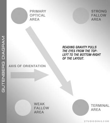
When we’re taught to read, we’re told to start at the top left corner of the reading matter and work our way across and down, going from left to right and back again, until we reach the bottom right corner. Arnold has devised what he calls the Gutenberg Diagram...the principles of which, he says, all design should respect.
He says the eyes fall naturally to the top left corner, which he calls the Primary Optical Area (POA). Then, the eyes move across and down the page, obeying reading gravity, and returning after each left-to-right sweep to an axis of orientation.
Any design which forces the reader to work against reading gravity, or fails to return him or her to a logical axis of orientation, tends to destroy reading rhythm and should, he asserts, be outlawed.”
As a side note, Edmund C. Arnold (born in 1913) is considered by many as the “father of modern newspaper design.” He is responsible for more than 250 newspaper designs throughout the United States, Canada, Iceland, New Zealand and Latin America and has written many textbooks on the subject.
From the Michigan Journalism Hall of Fame